Project overview
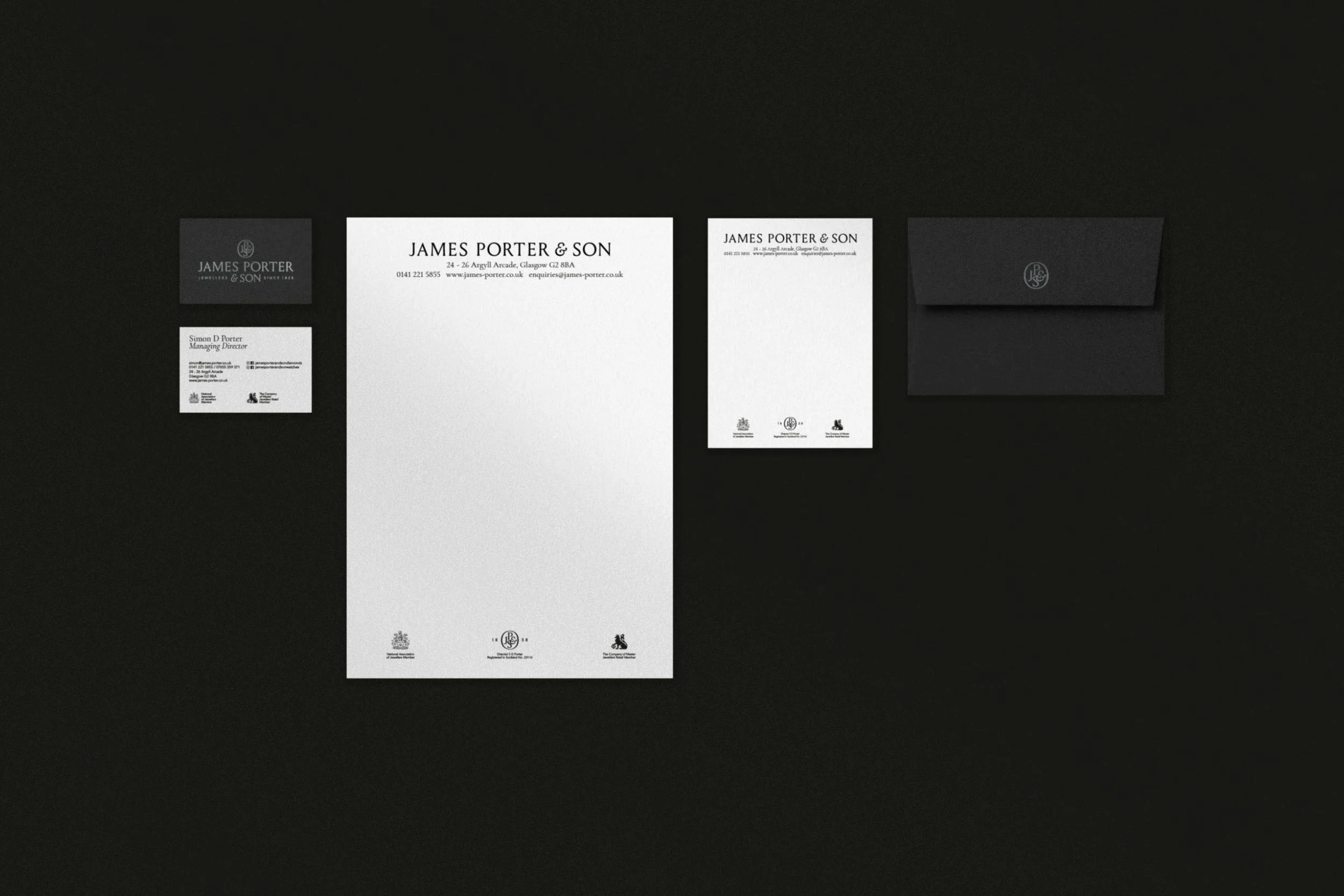
James Porter & Son was the first jeweller to open in Glasgow’s Argyll Arcade, over 160 years ago. They're also the fifth oldest business in Scotland, now run by the sixth generation of Porters. Collaborating with MLT Digital, who expertly handled their marketing strategy, we were tasked with creating a refreshed brand identity that honours their rich heritage while appealing to modern customers.
The new branding features a custom wordmark, seal, and a sub-brand identity for their Porter’s Signature Collection. At the heart of the new identity is the Louize typeface by 205TF, which perfectly embodies James Porter & Son’s blend of tradition and modernity. Its classic serif design pays homage to the brand’s rich history, while contemporary refinements give it a fresh, polished look. This balance of timeless elegance enhances the sense of quality and luxury across every touchpoint, from packaging to digital platforms.
The resulting brand identity preserves the legacy of craftsmanship while positioning James Porter & Son for continued relevance in the competitive luxury market.
What we did
Brand identity
Brand Guidelines
Stationery
Website design
Exhibition Design
Digital Adverts


